Projects Gallery
Power BI Projects
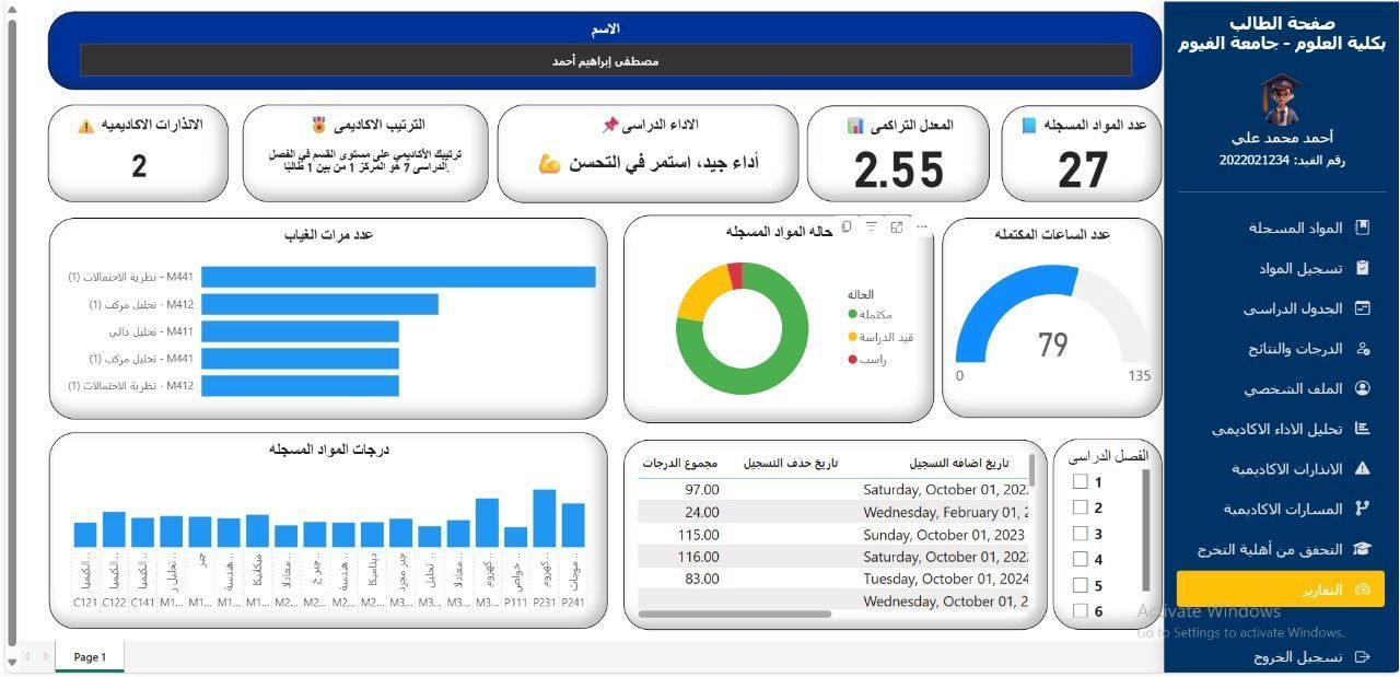
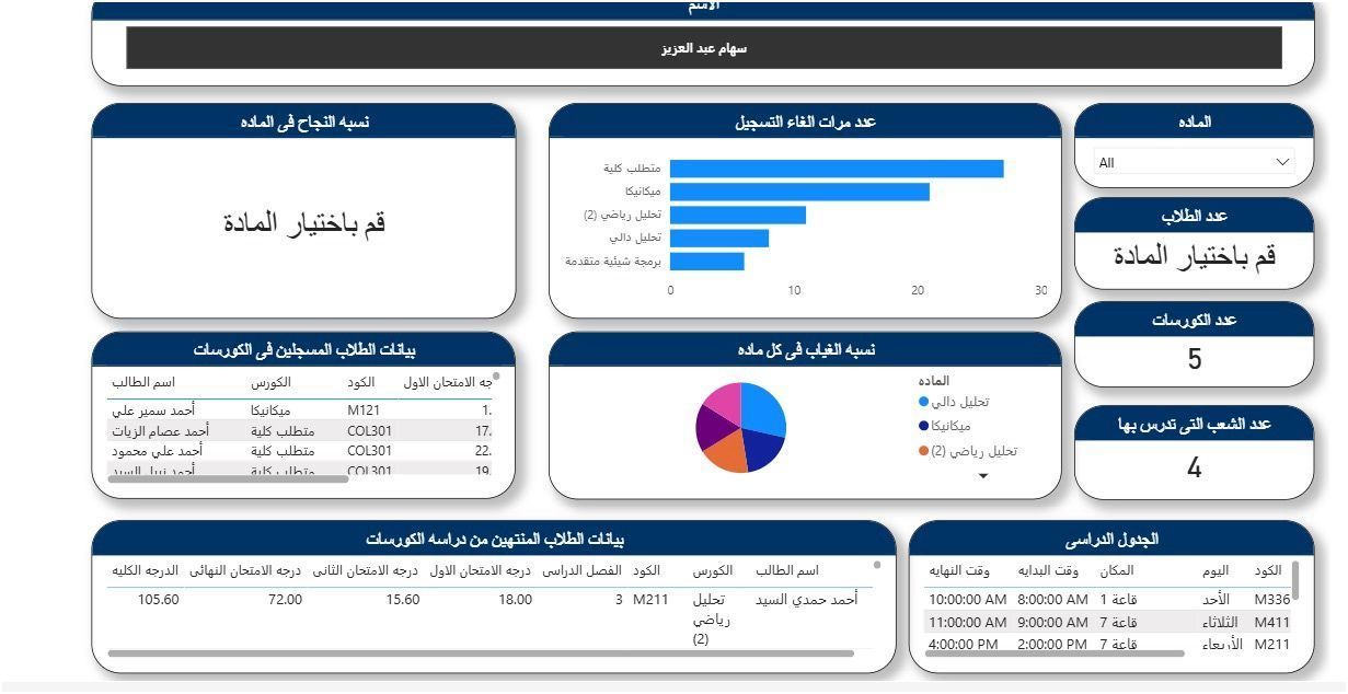
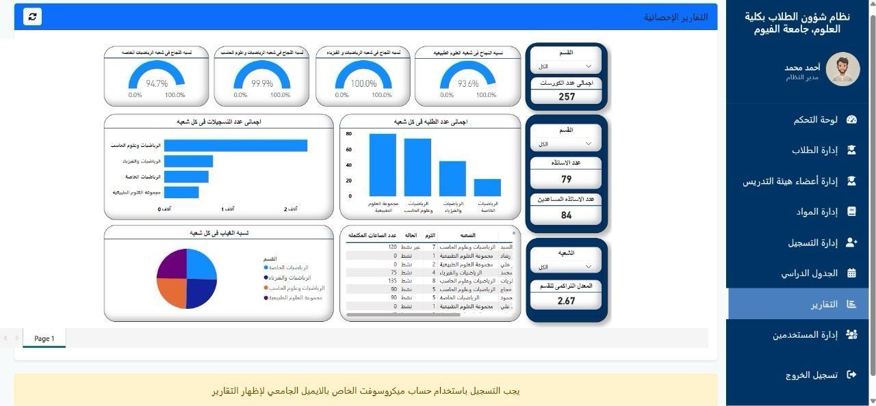
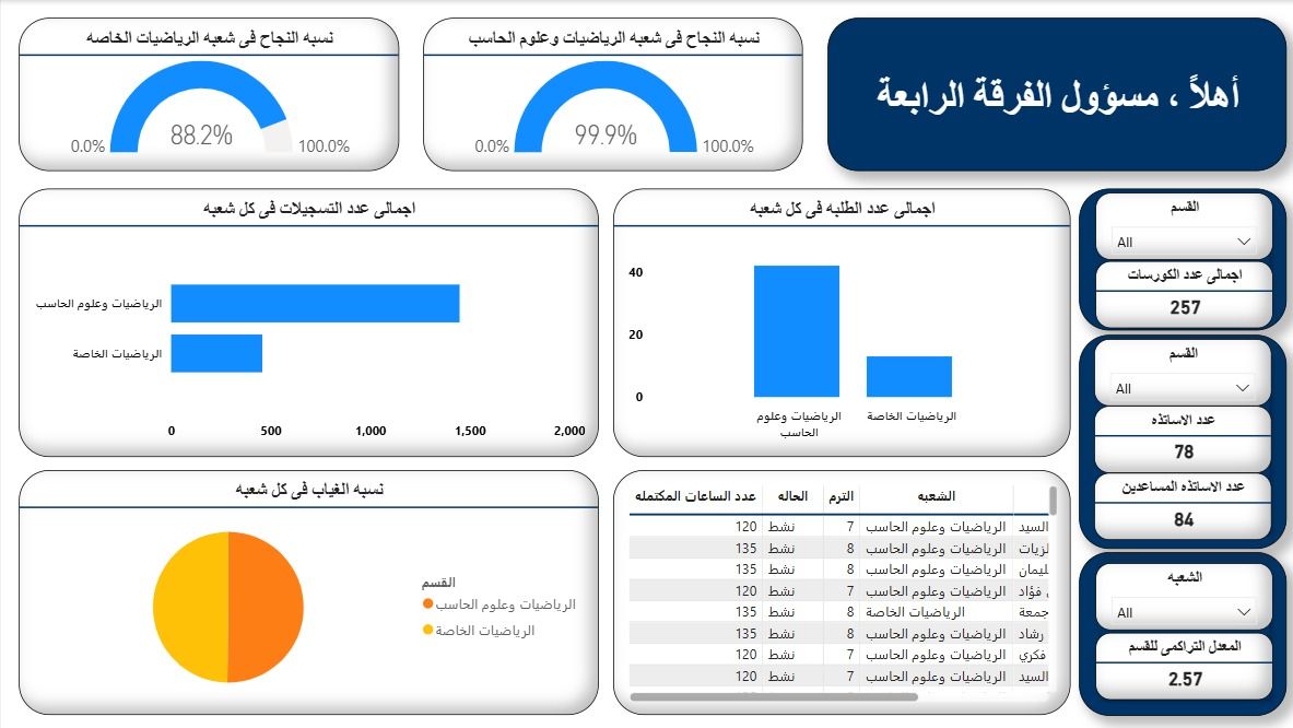
Expert System of Student Affairs Management (Graduation Project)
The University Student Affairs Dashboard is an integrated data visualization system designed to support administrative, academic, and student performance monitoring at Fayoum University – Faculty of Science. The system provides a centralized interface that displays key academic metrics such as course registration statistics, student grades, attendance records, department performance, and faculty workload distribution. It enhances decision-making by offering real-time, interactive reports that summarize student progress, course outcomes, and departmental efficiency.
Key Insights:
Comprehensive Student Tracking: Enables real-time monitoring of student academic progress, GPA, attendance, and registration history. Faculty and Course Analytics: Displays data on course enrollments, teaching hours, and faculty participation across semesters. Performance Visualization: Interactive charts and dashboards help identify trends in student success rates, course completion, and absenteeism. Decision Support: Provides actionable insights for academic advisors and administrators to improve student outcomes and optimize resource allocation. User Roles: Supports multiple access levels (e.g., student, instructor, department head, system administrator) for data privacy and role-based reporting.
Dashboard Integration:
Database Integration: Connected to the university’s academic database to automatically retrieve student records, grades, and schedules. Microsoft Authentication: Uses Microsoft university accounts for secure login and role-based access. Data Visualization Tools: Built using modern dashboard technologies (e.g., Power BI or web-based chart libraries) for dynamic data representation. Modular System Design: Seamlessly integrates modules for student management, faculty management, course registration, and performance reports. Cross-Platform Accessibility: Designed for accessibility on both desktop and web, ensuring ease of use for staff and students alike.
Repository Link:
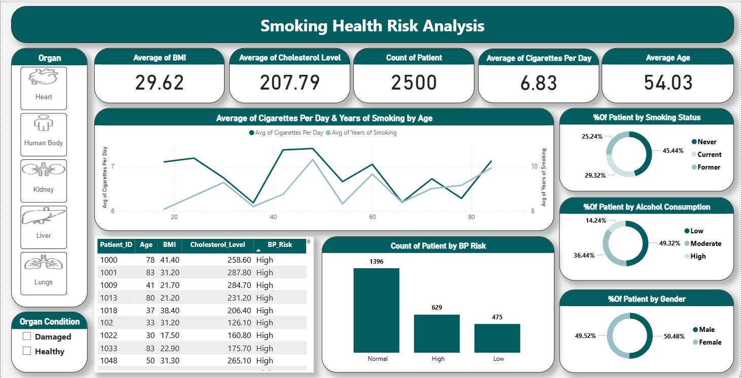
Smoking Health Risk Analysis
This project aims to analyze patient health data and identify the impact of lifestyle habits and medical risk factors on overall organ health. The dataset includes patient demographics, smoking and alcohol consumption habits, blood pressure risk levels, BMI, cholesterol levels, and organ health conditions. Using Power BI, the data was modeled and visualized to provide an interactive and user-friendly dashboard that supports data-driven health analysis.
Key Insights:
A noticeable increase in organ damage rates among patients with high blood pressure risk Smoking and high alcohol consumption show a strong correlation with damaged organ conditions, Patients with higher BMI levels tend to have increased health risks, Organ-level filtering reveals that risk factors impact organs differently, highlighting the importance of targeted analysis rather than general averages, The Health Balance KPI provides a quick snapshot of whether healthy cases outweigh damaged cases under different conditions
Repository Link:
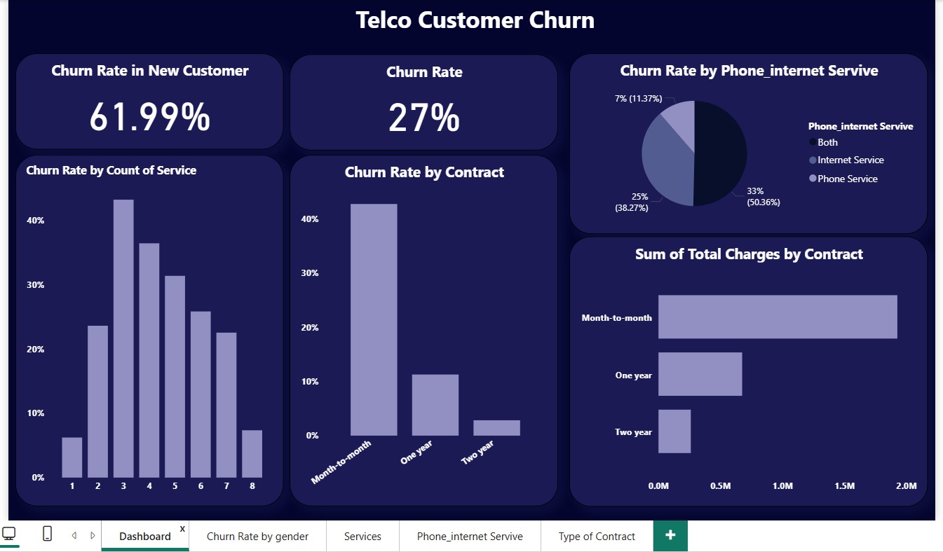
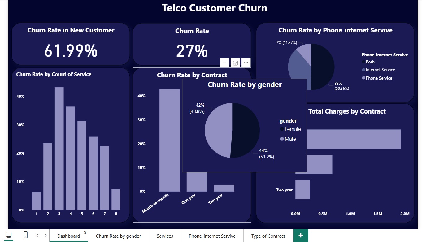
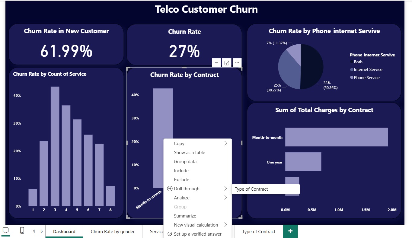
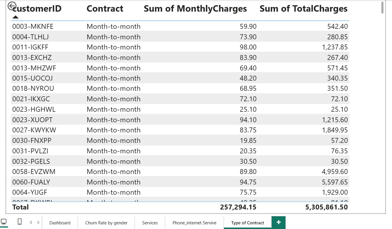
Telco Customer Churn Dashboard
Comprehensive Power BI dashboard designed to analyze customer churn patterns for a telecommunications company. The report consolidates data on customer demographics, contract types, payment methods, and service usage to uncover key factors influencing churn. It provides business users with real-time insights into customer retention trends, high-risk segments, and revenue impact, empowering data-driven decision-making to improve customer loyalty and reduce attrition.
Key Insights:
Overall churn rate analyzed across multiple customer segments, highlighting the impact of contract duration and payment methods. Identified high churn rates among month-to-month contracts and customers using electronic check payments. Discovered that customers with fiber optic internet services exhibit the highest churn tendency. Visualized demographic patterns showing senior citizens and single-service users as key at-risk groups. Provided actionable insights for retention strategies, including targeted offers and loyalty programs.
Repository Link:
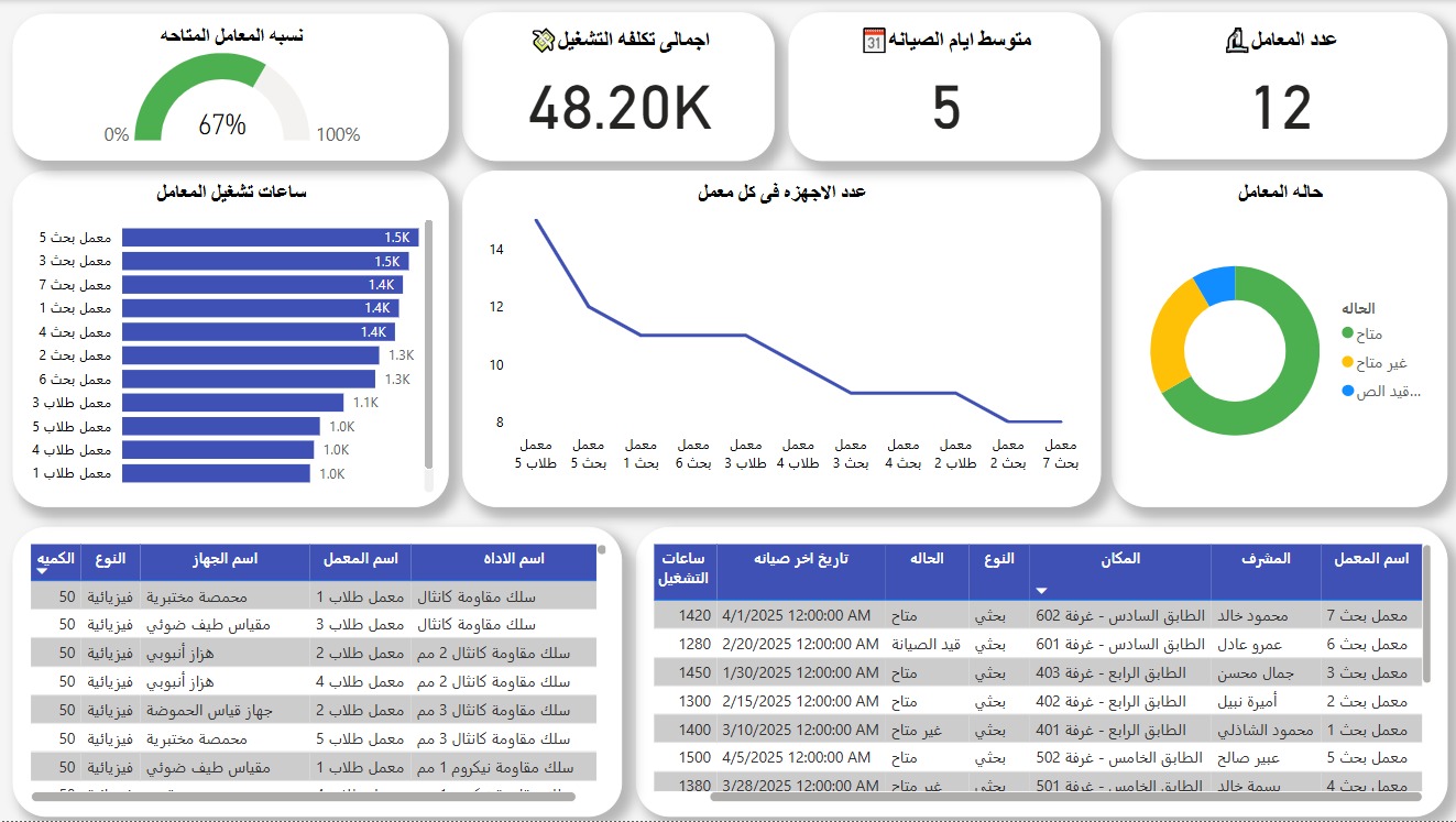
Physics Lab Management System 1
Comprehensive Physics Laboratory Operations Dashboard built with Power BI for Faculty of Science laboratory management. This advanced system monitors lab utilization rates, tracks operational costs, manages equipment across 12 laboratories, and provides detailed analytics on lab performance, maintenance schedules, and resource allocation. The dashboard enables supervisors to optimize lab efficiency and make data-driven decisions for equipment management.
Key Insights:
Achieved 67% laboratory utilization rate across 12 labs with 48.20K total operational costs and 5-day average maintenance cycle. Optimized equipment distribution from 14 to 8 devices per lab through strategic resource allocation, maintained detailed tracking of lab sessions with peak usage in Research Labs 5 and 7 (1.5K+ sessions each), and implemented comprehensive maintenance scheduling resulting in improved equipment availability and operational efficiency.
Dashboard Integration:
Published to Power BI Service with row-level security implementation and embedded into the university portal via responsive iframe integration, enabling role-based access for different user groups including lab supervisors, department heads, and maintenance staff.
Repository Link:
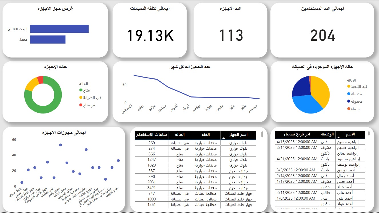
Physics Lab Management System 2
Advanced Physics Laboratory Management Dashboard developed using Power BI for the Faculty of Science Physics Department. This comprehensive system tracks equipment reservations, monitors device status across multiple labs, analyzes usage patterns, and manages maintenance schedules. The dashboard provides real-time insights into lab utilization, equipment health, and operational efficiency for laboratory supervisors and department administrators.
Key Insights:
Managed 19.13K total maintenance costs across 113 devices serving 204 users, achieved optimal equipment distribution with 60% available devices and strategic maintenance scheduling. Identified seasonal usage patterns with peak activity in September-October, maintained comprehensive equipment tracking across 4 laboratory locations, and streamlined reservation system resulting in improved lab accessibility.
Dashboard Integration:
Successfully published to Power BI Service with automated data refresh schedules and integrated into the faculty website using secure iframe embedding with mobile-responsive design, ensuring optimal viewing experience across all devices and providing 24/7 access to lab management insights.
Repository Link:
SQL Projects
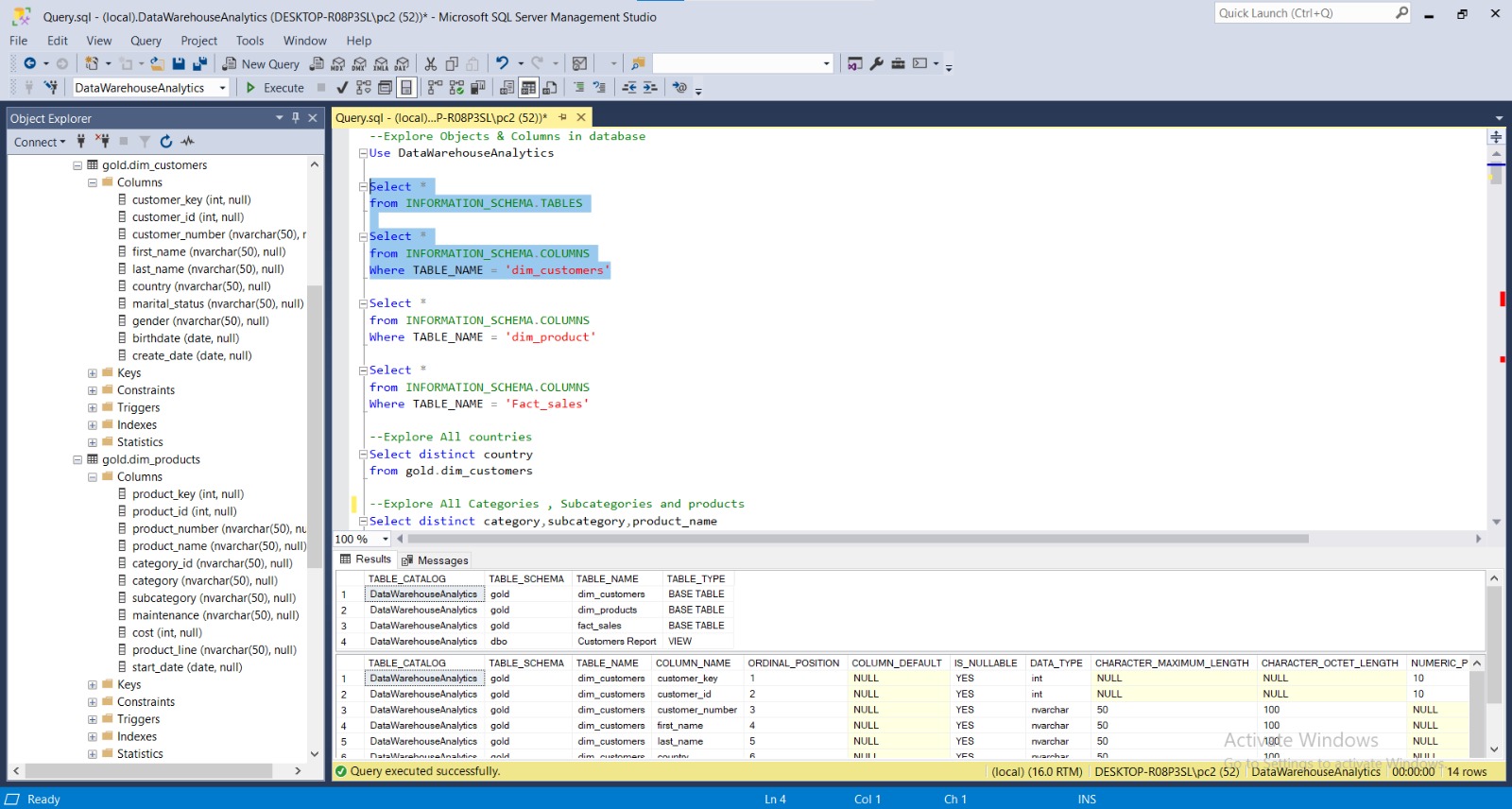
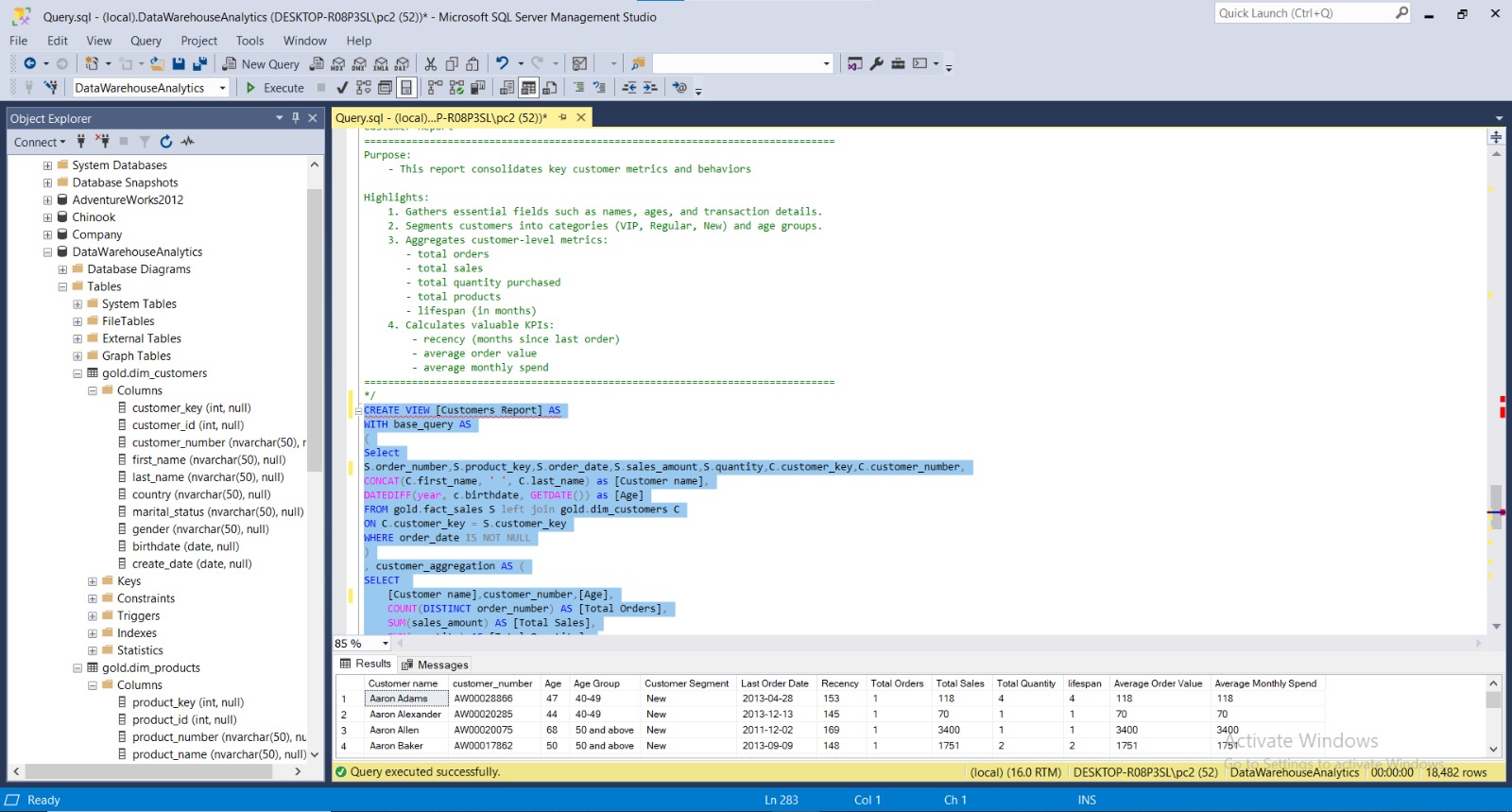
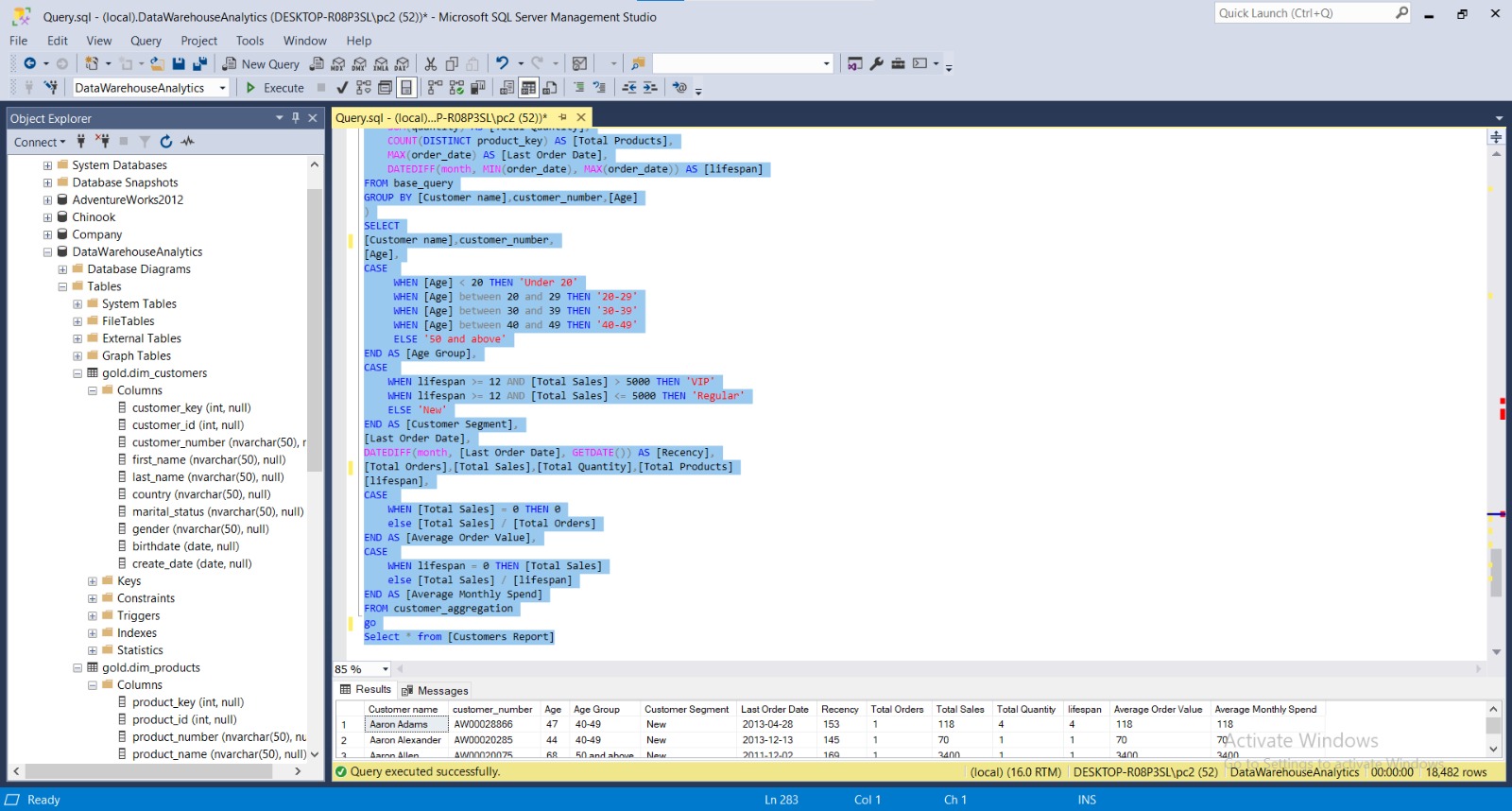
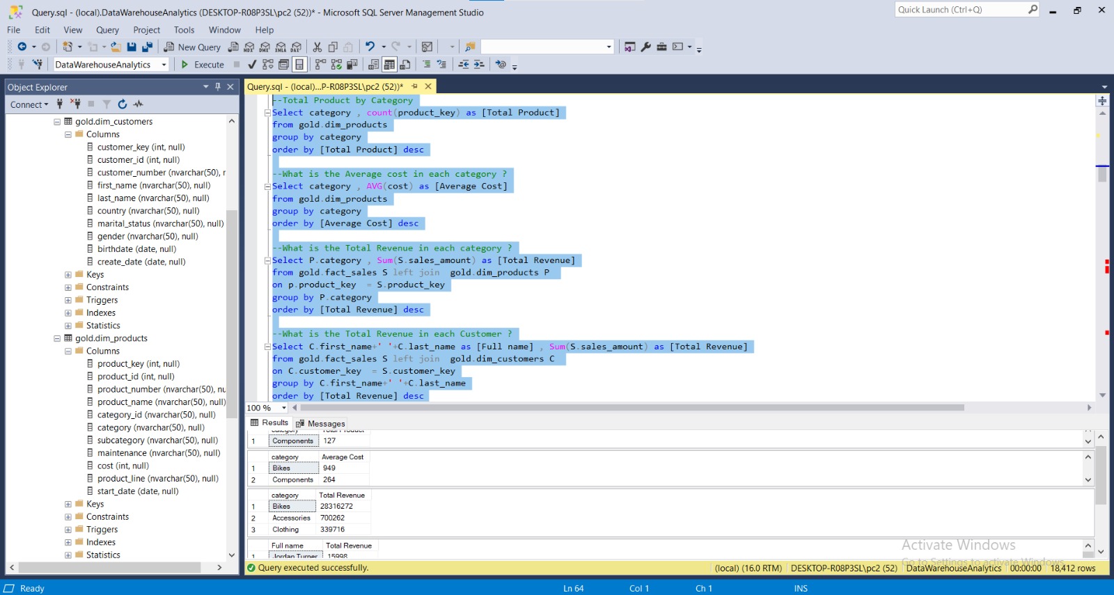
Sales Analysis
The Sales Analysis Project is reinforced one key lesson: the most effective analysis isn’t about having more charts,but about delivering the right insight at the right time.
Repository Link:
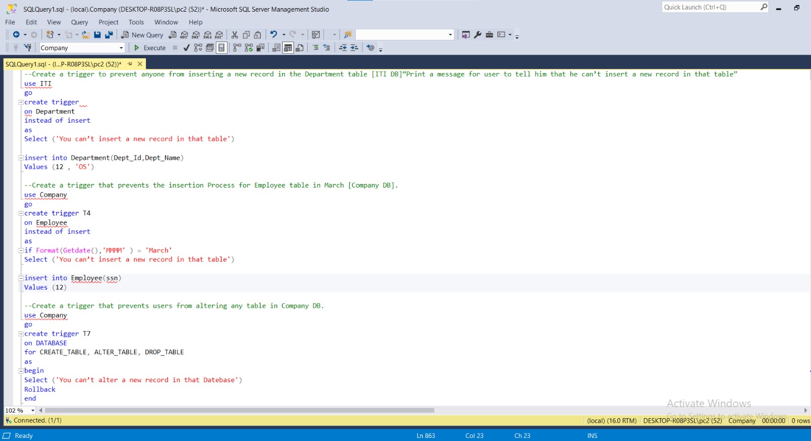
SQL Tasks
Repository Link:
Tableau Projects
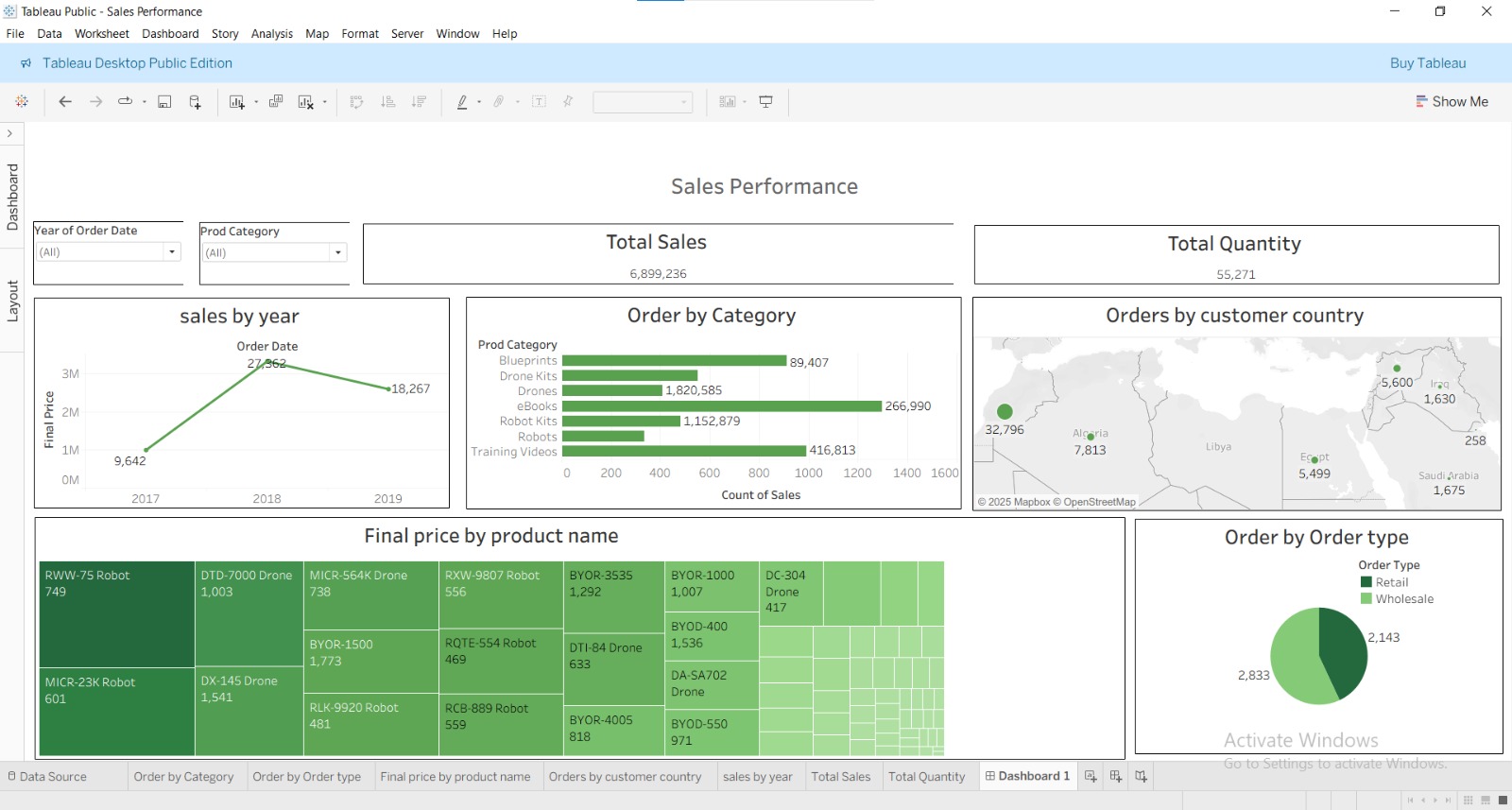
Sales Performance Dashboard
Interactive Tableau dashboard designed to visualize and analyze sales performance across different product categories, customer locations, and order types. The report consolidates key sales metrics such as total revenue, quantity sold, and yearly trends to provide a comprehensive view of business growth and market distribution. It helps management identify top-performing products, high-revenue regions, and key factors driving sales performance, supporting data-driven business decisions.
Key Insights:
Achieved total sales of 6.89M with 55K total orders across multiple regions. Drones and Robot Kits recorded the highest sales among all product categories. Sales peaked in 2018, showing strong growth compared to previous years. Algeria and Iraq were the leading countries in order volume within the MENA region. Retail orders slightly exceeded wholesale orders, highlighting strong consumer demand. Product and regional visualizations revealed key opportunities for sales optimization and inventory planning.
Excel Projects
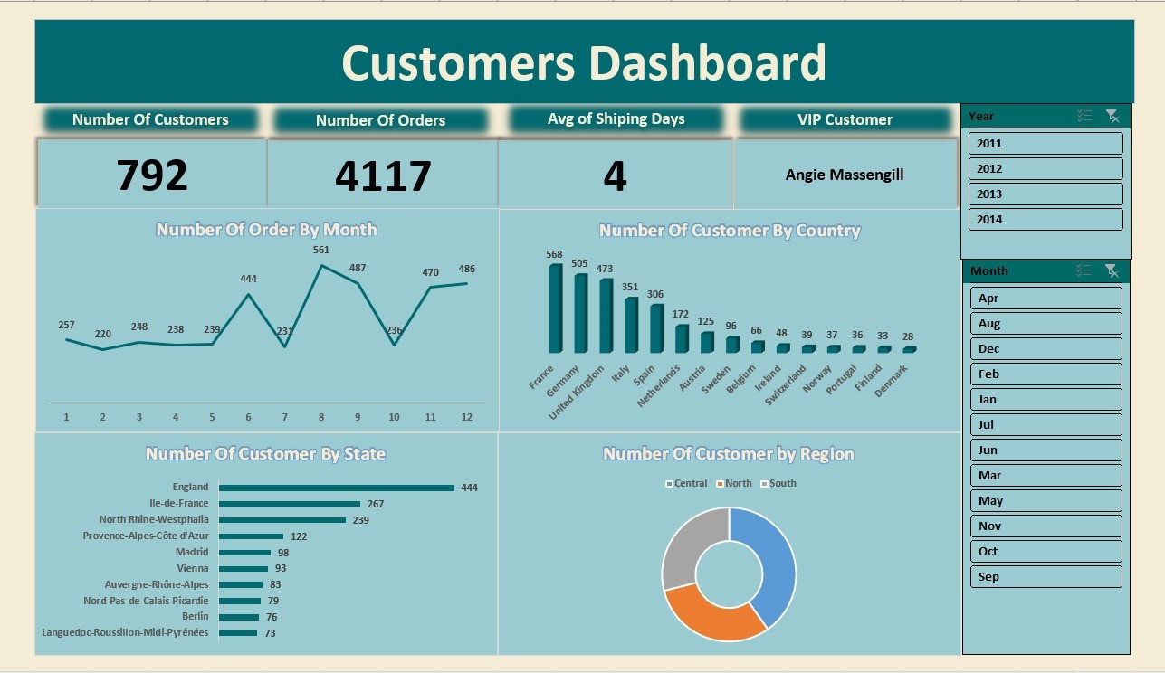
Customer Behavior Analysis
In-depth analysis of customer purchasing patterns using Excel and advanced formulas for comprehensive customer relationship management. This interactive system tracks customer demographics, order patterns, shipping performance, and geographic distribution across multiple regions. Features dynamic filtering by year and month, automated KPI calculations, and visual analytics including charts and geographic breakdowns for strategic business decision-making.
Key Insights:
Analyzed 792 customers generating 4,117 orders with 4-day average shipping time, identified Angie Massengill as VIP customer through advanced segmentation analysis. Discovered seasonal ordering patterns with peak activity in months 8-11 (470-486 orders), achieved balanced international customer distribution led by France (568 customers) and Germany (505 customers), and maintained strong regional presence across Central, North, and South territories resulting in optimized logistics.
Repository Link:
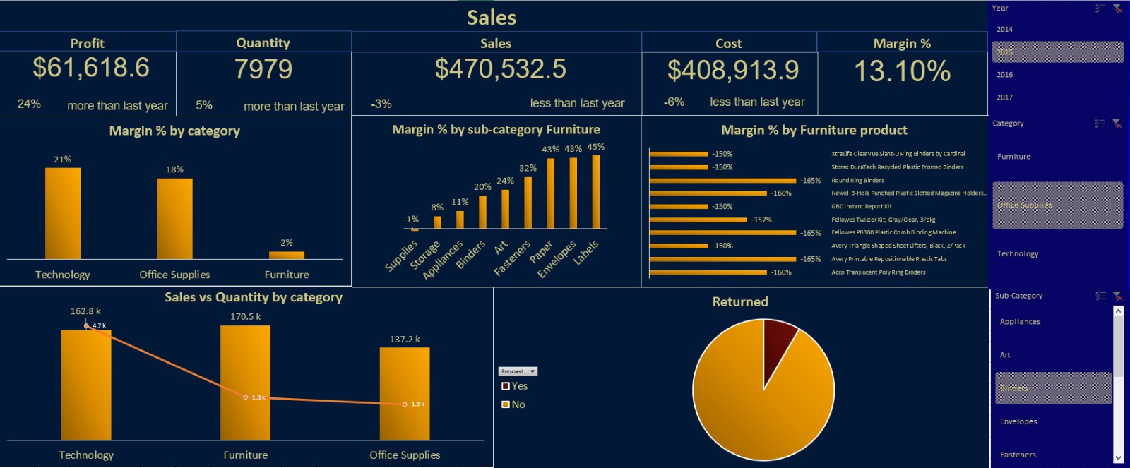
Sales Analytics Dashboard
Advanced Sales Performance Analytics Dashboard developed using Power BI featuring comprehensive business intelligence capabilities. This interactive dashboard provides real-time insights into sales performance, profitability analysis, and product category trends across multiple dimensions. The system integrates advanced DAX calculations, dynamic filtering by year and category, and sophisticated visualizations including KPI cards, bar charts, combination charts, and pie charts for comprehensive sales analytics and strategic decision-making.
Key Insights:
Generated $470,532.5 in total sales with 13.10% overall margin, achieving 24% profit growth despite 3% sales decline through strategic cost management (6% reduction). Identified Technology as top performer with 21% margin while revealing critical Furniture category issues at 2% margin with multiple products showing negative margins from -150% to -165%. Discovered high-potential sub-categories including Labels (45%) and Paper (43%) margins, and maintained exceptional customer satisfaction with minimal return rates.
Repository Link:
Python Projects
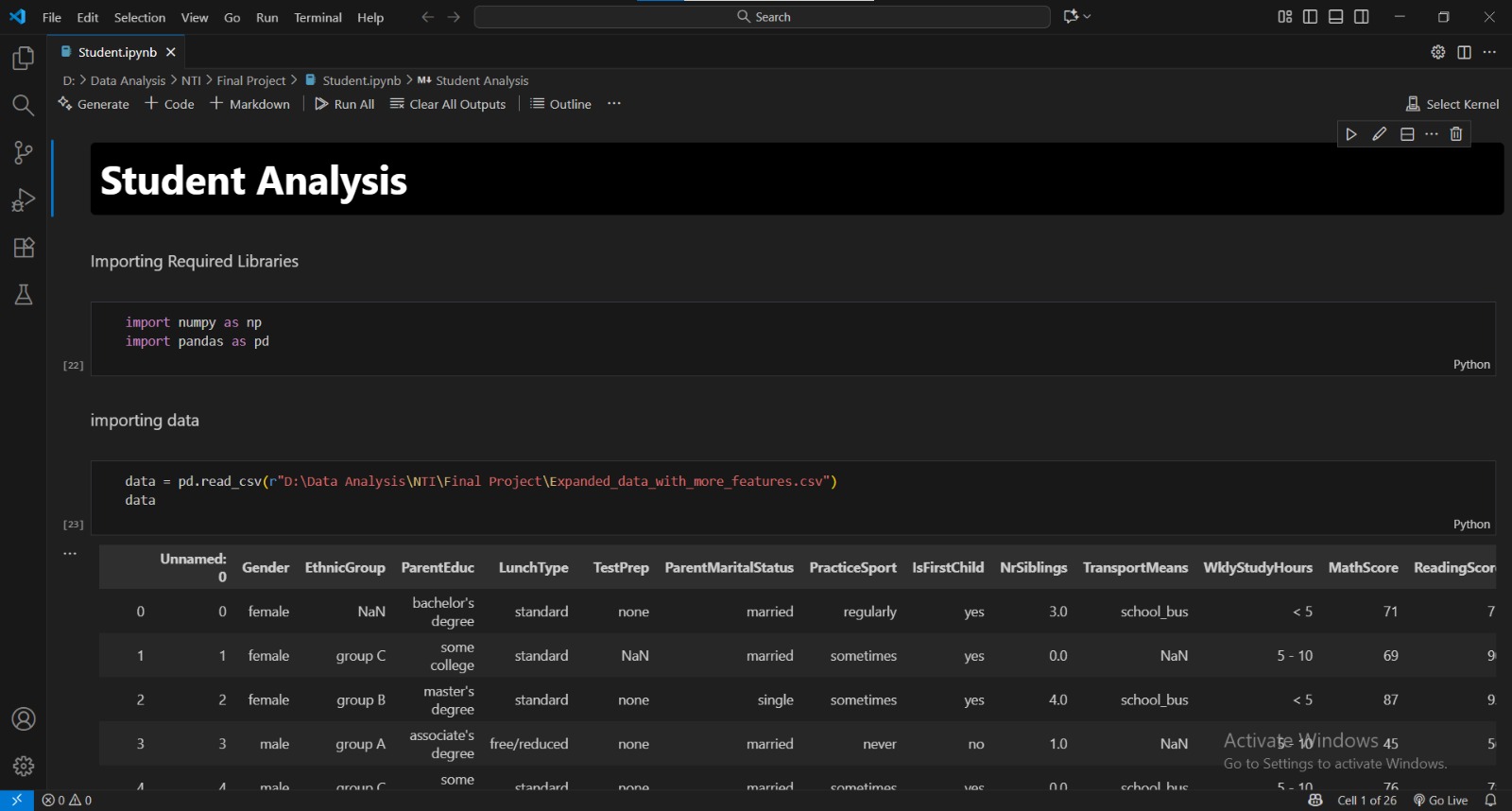
Student Analysis
Interactive Power BI dashboard designed to analyze and monitor student academic performance across multiple subjects and semesters. The dashboard consolidates student records, attendance, exam results, and demographic details to identify performance trends and areas for improvement. It supports academic supervisors and educators in making data-driven decisions to enhance student engagement, optimize learning outcomes, and track institutional performance metrics. My role: Responsible for the data cleaning & preprocessing stage using Python (Pandas, NumPy), which included handling missing values, standardizing formats, feature engineering, and preparing the dataset for reliable analysis and visualization in Power BI.
Key Insights:
Analyzed student grades across various subjects to identify top-performing and at-risk students. Discovered a strong correlation between attendance rate and academic performance. Highlighted performance gaps across departments, gender, and study levels. Enabled early identification of students requiring academic intervention through predictive trends. Provided insights for improving curriculum planning and academic advising strategies. Note on data work: Cleaned and validated the dataset programmatically in Python to ensure accuracy of the insights and reliability of downstream visualizations.
Repository Link:
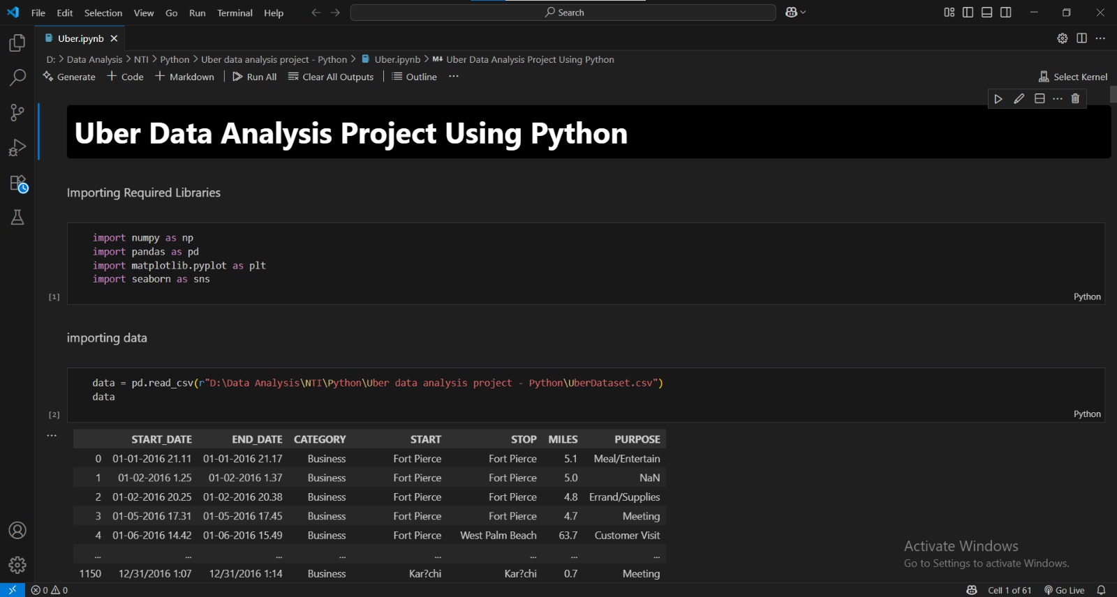
Uber Data Analysis
This project focuses on analyzing real-world Uber trip data using Python to uncover mobility trends, peak ride times, and demand patterns across different city zones. Through data preprocessing, exploratory data analysis (EDA), and advanced visualization techniques, the dashboard provides actionable insights to support data-driven operational and strategic decisions in ride-hailing services. The analysis highlights customer behavior patterns, seasonal ride fluctuations, and high-demand locations — enabling improved resource allocation and better forecasting models.
Key Insights:
Analyzed thousands of Uber rides to detect activity peaks and usage patterns across time and geography. Identified the busiest days and hours, enabling optimized driver scheduling and surge pricing strategies. Detected location hotspots and high-demand pickup zones, supporting improved resource placement. Observed seasonal and weather-influenced demand variations, valuable for operational planning. Highlighted trip frequency trends to understand user behavior and service utilization patterns.